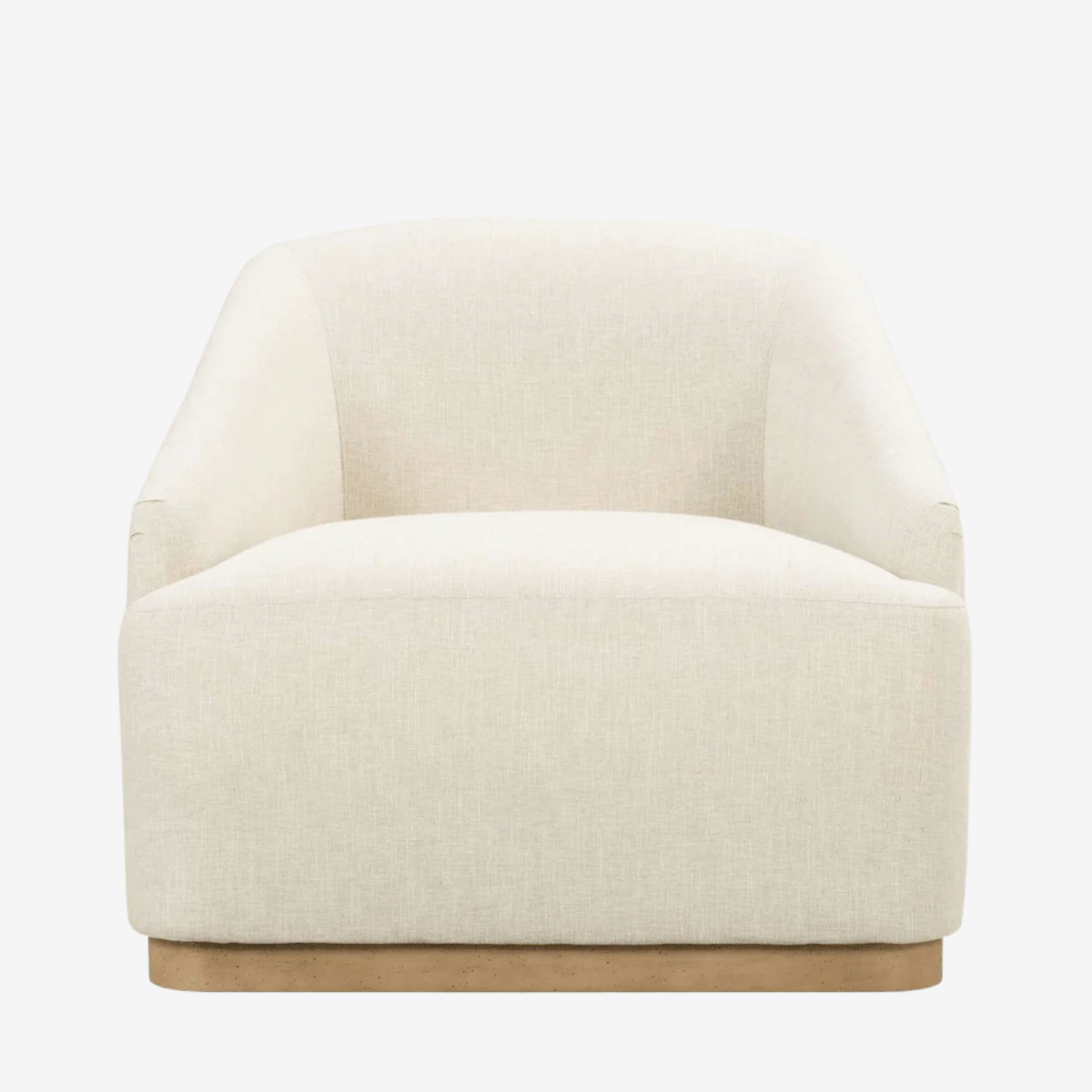
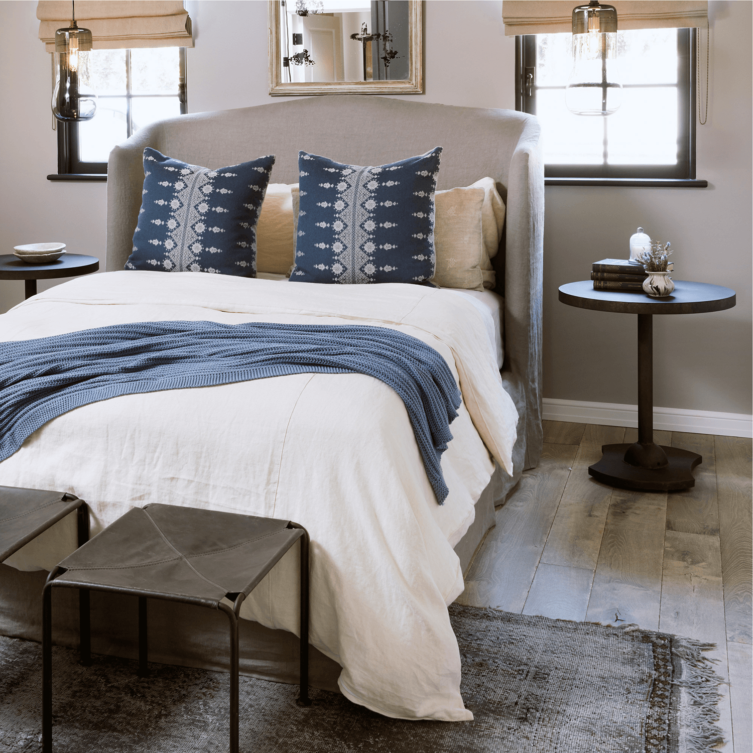
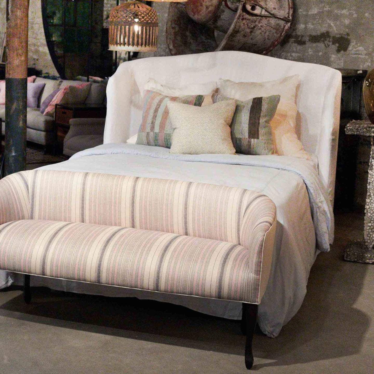
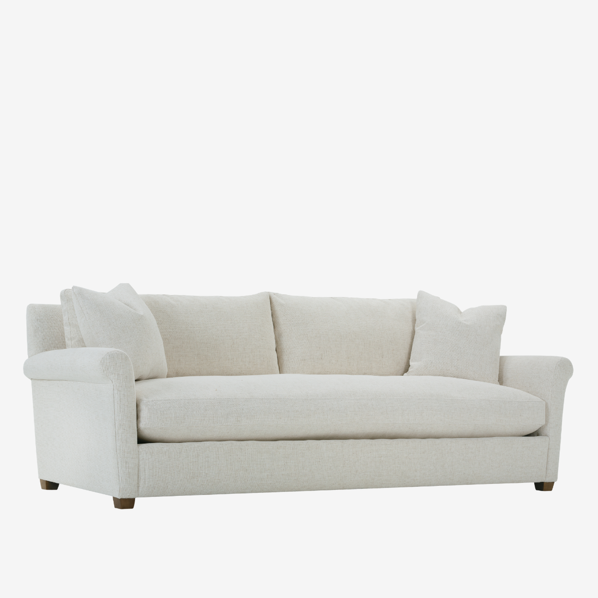
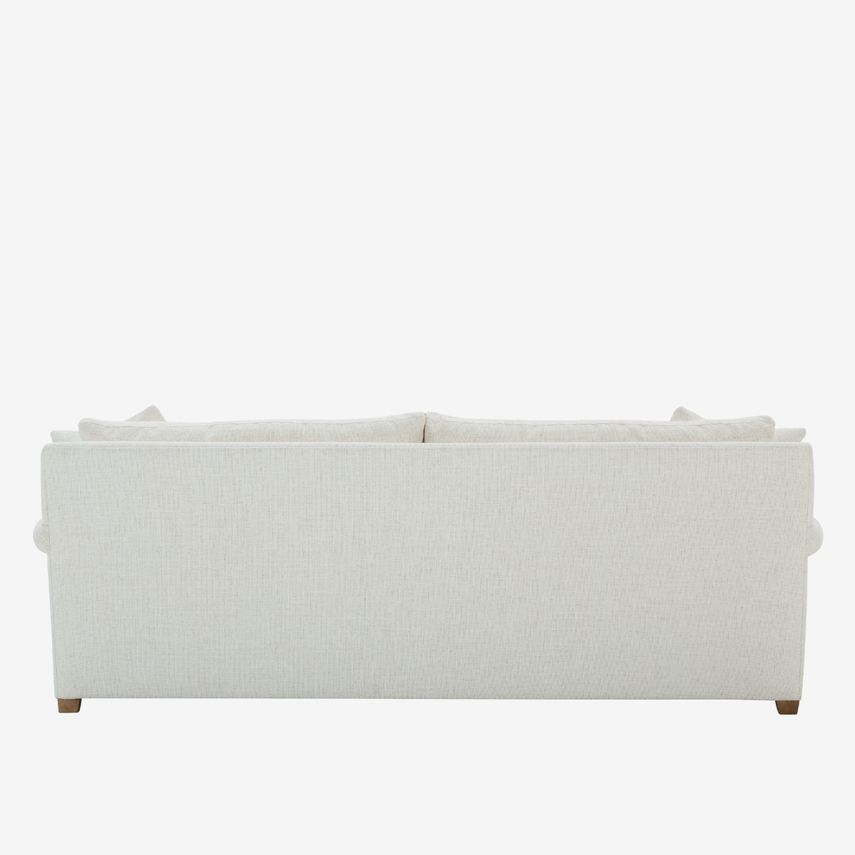
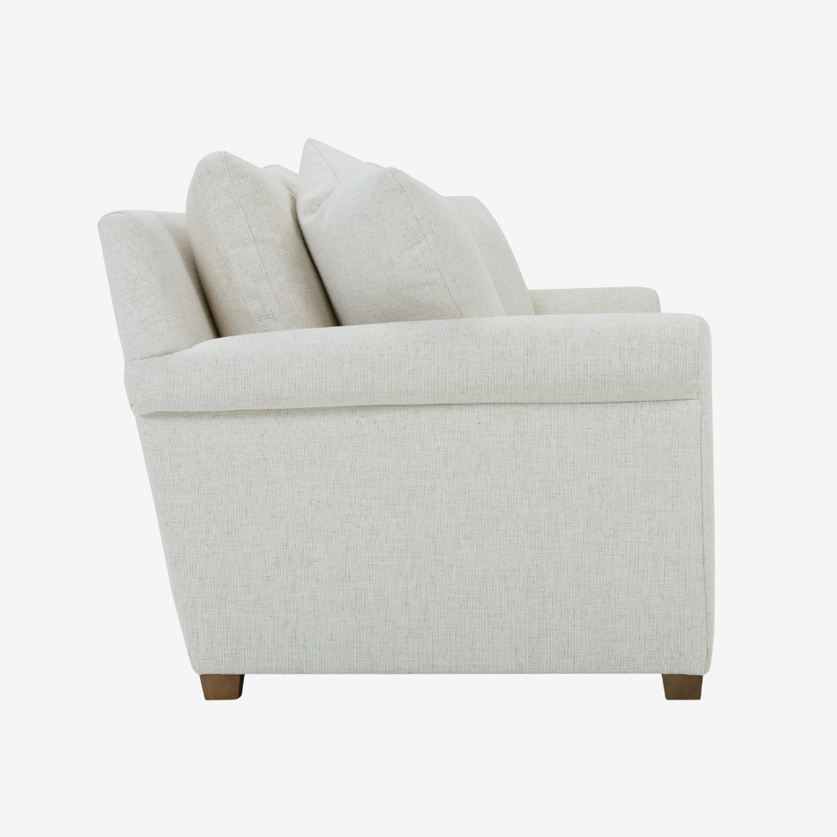
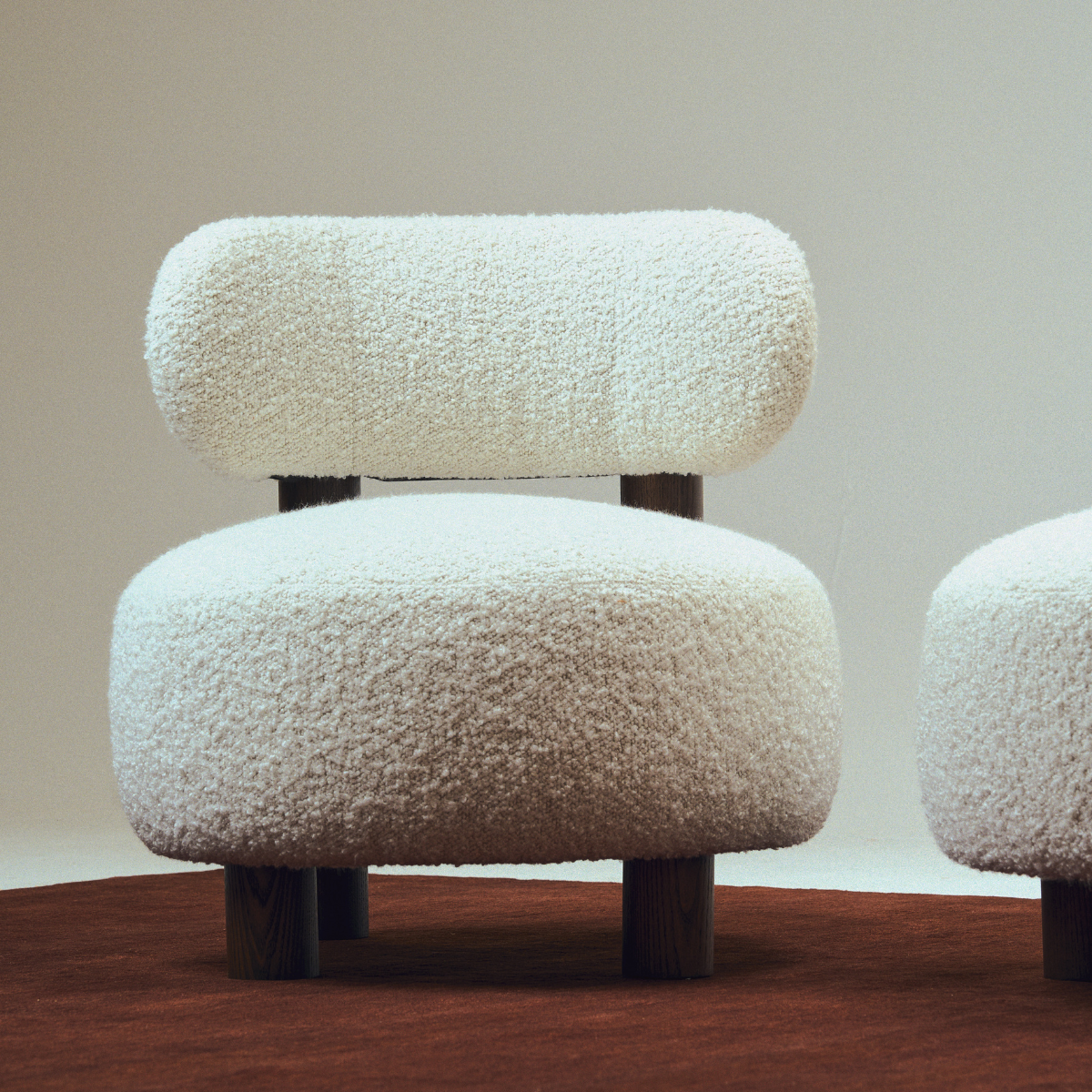
Pantone Announces Its 2026 Color of the Year: Cloud Dancer
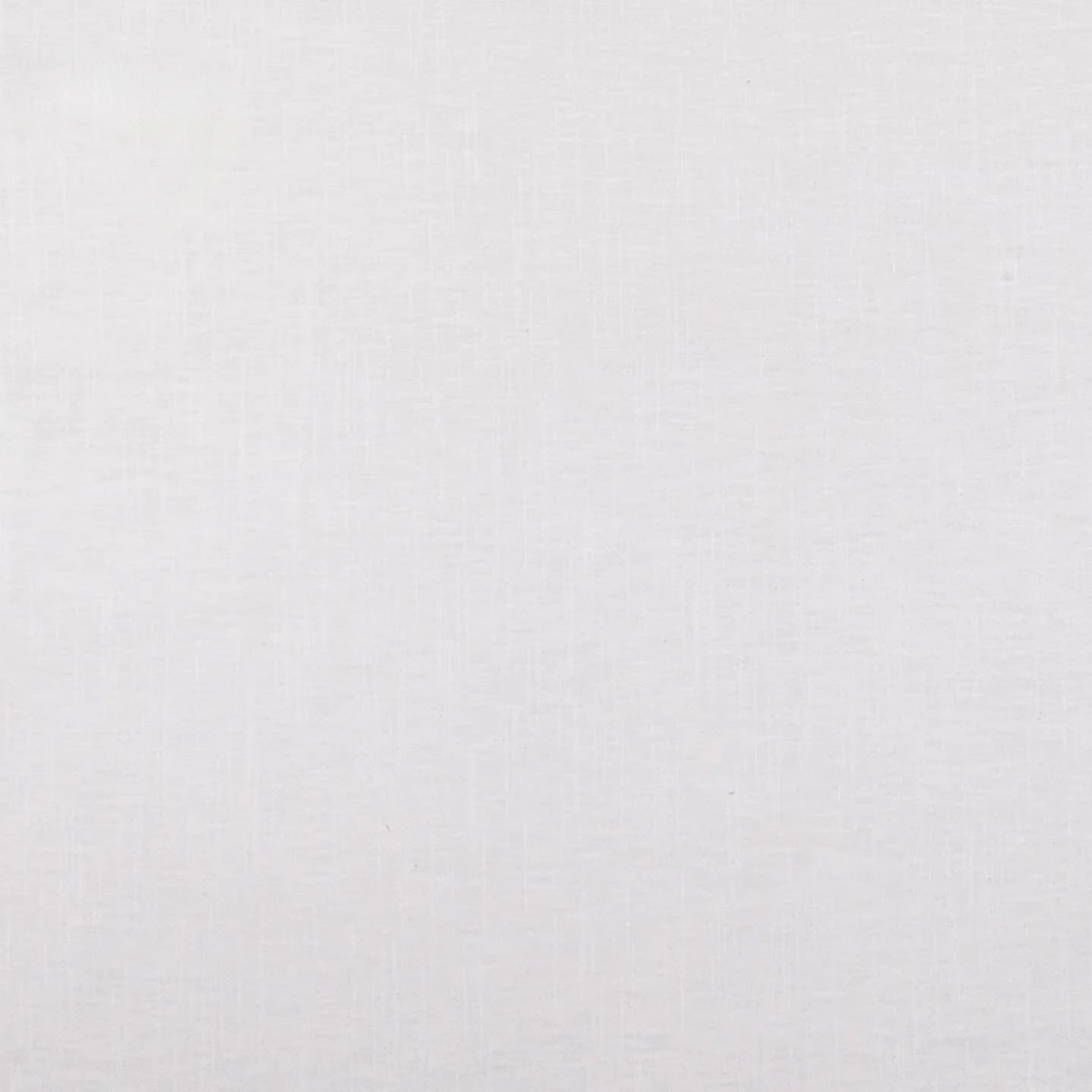
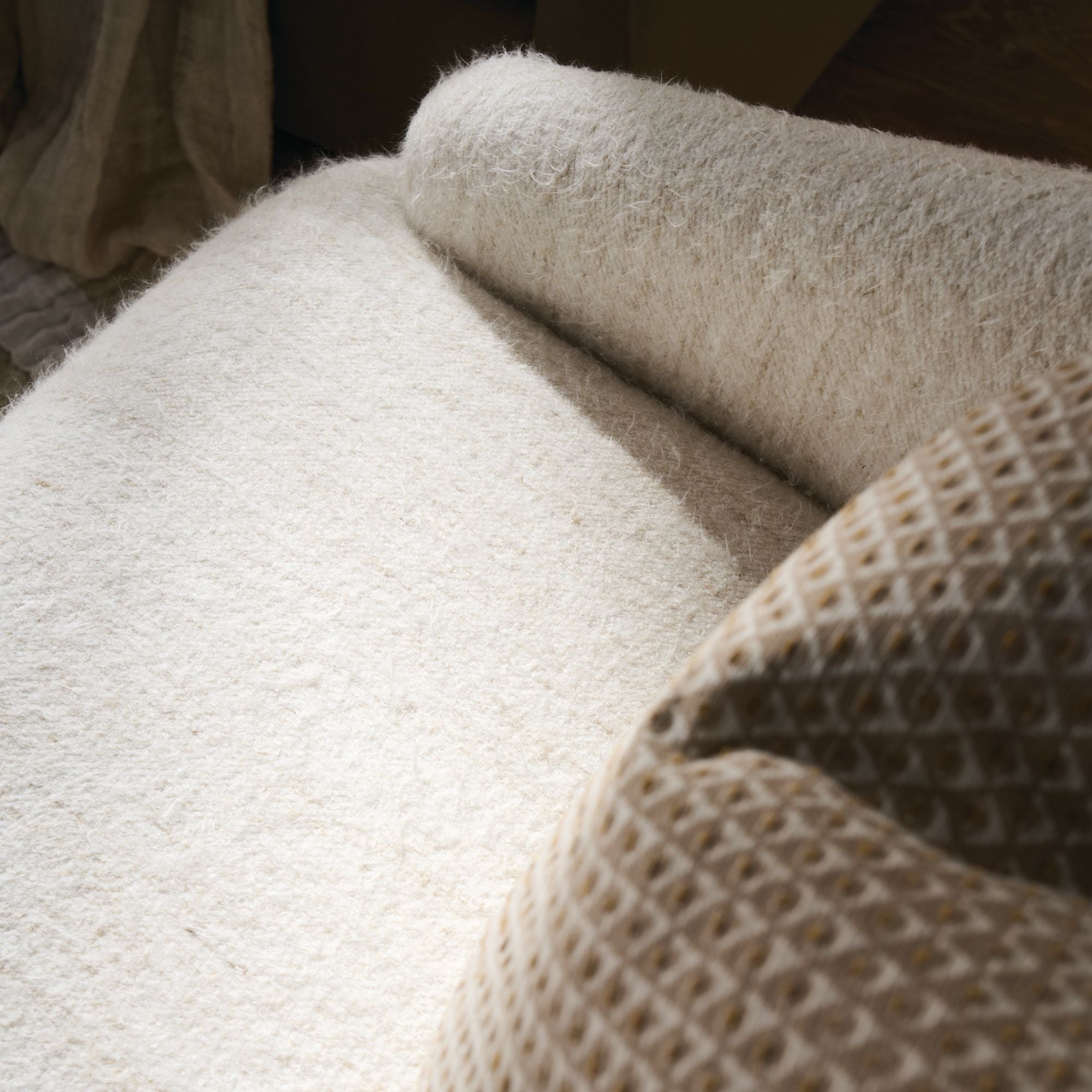
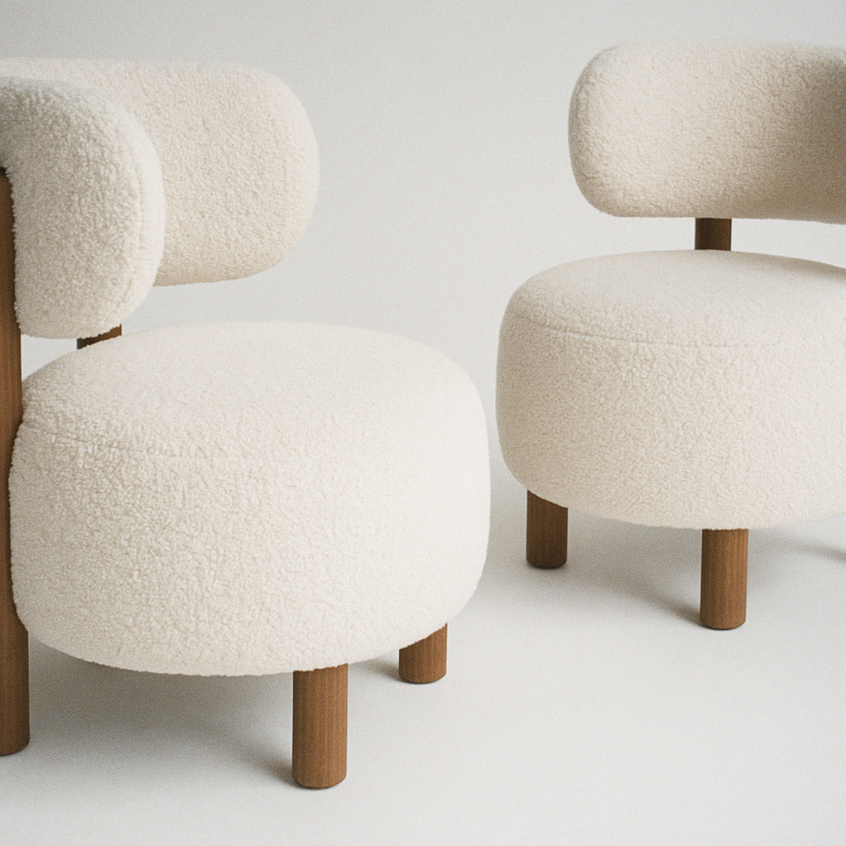
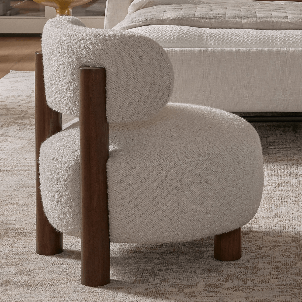
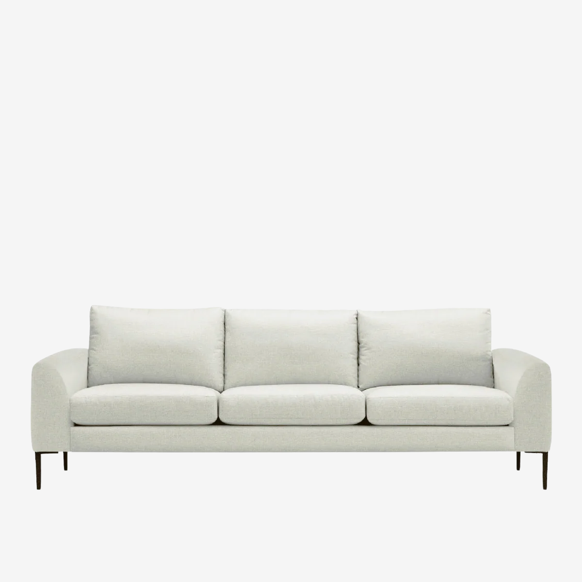
The fresh start of a brand new year is usually a time for setting hopeful intentions, and looking ahead with an optimistic eye. This year, Pantone’s 2026 Color Of The Year just happens to be the perfect complement for both! PANTONE 11-4201, or “Cloud Dancer” is a vibrant white that inspires a sense of creative aspiration and soothing peace in a time when the distractions of our world can feel overwhelming. Serene, clean, and expansive, Cloud Dancer invites us to reimagine the possibilities for our future, and to create more space for thoughtful nuance, self-reflection, and collaborative perspectives. Here are just a few of the color palettes you might use to bring Cloud Dancer to life at home this year:

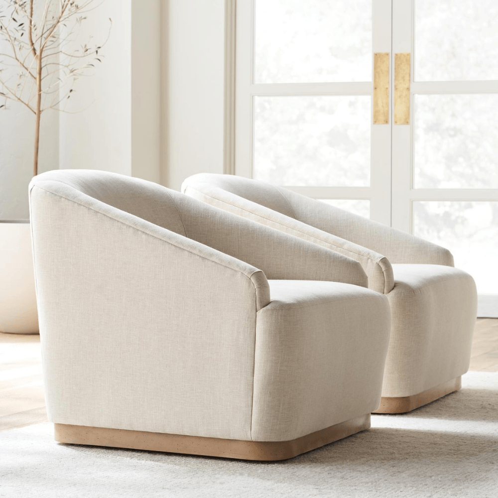
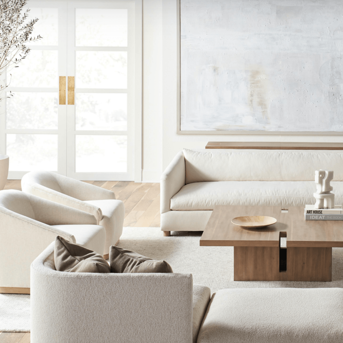
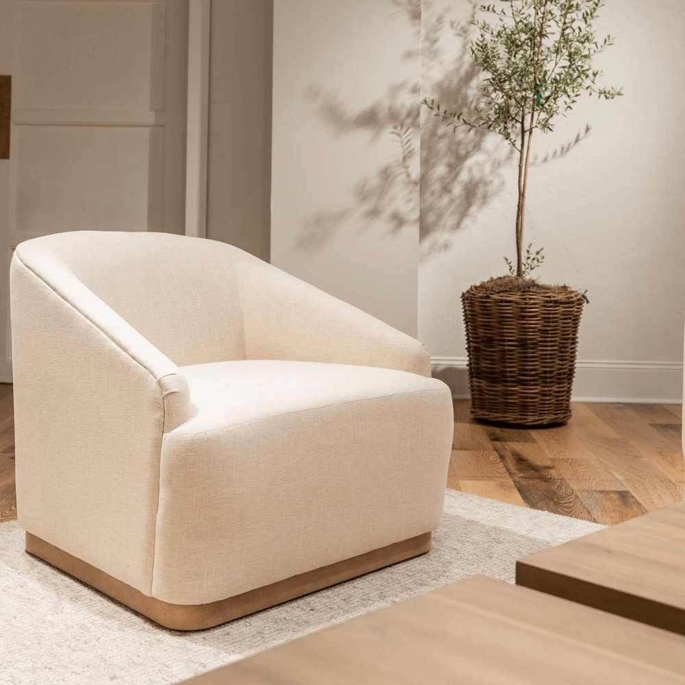
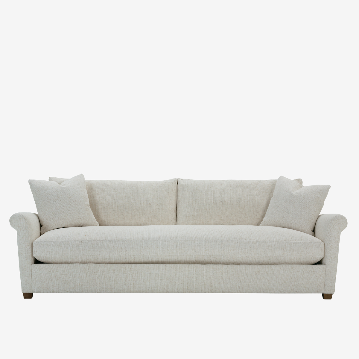
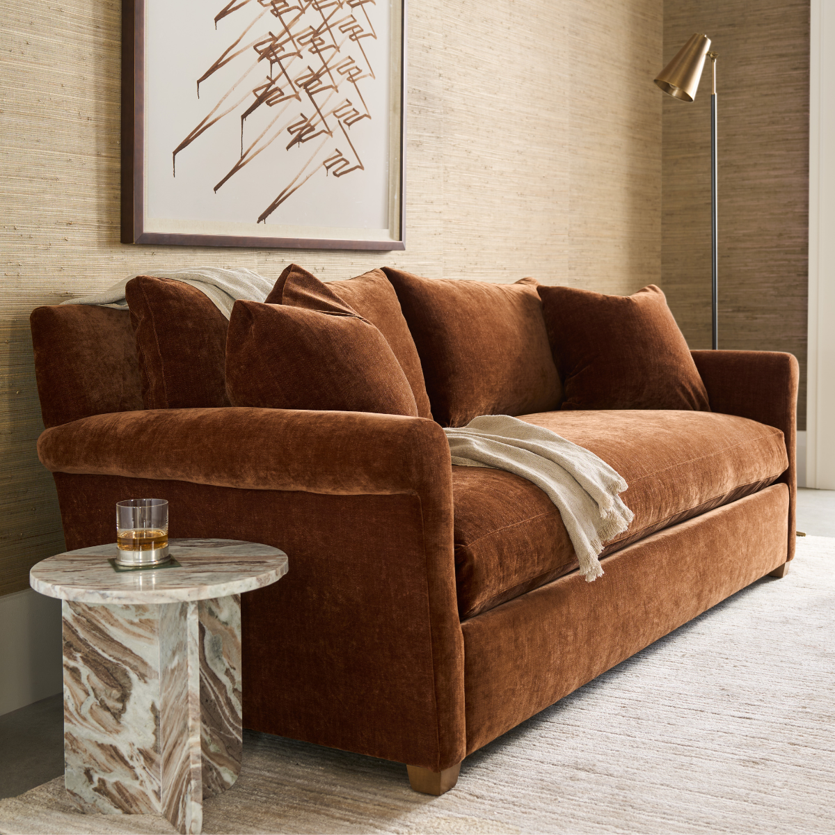
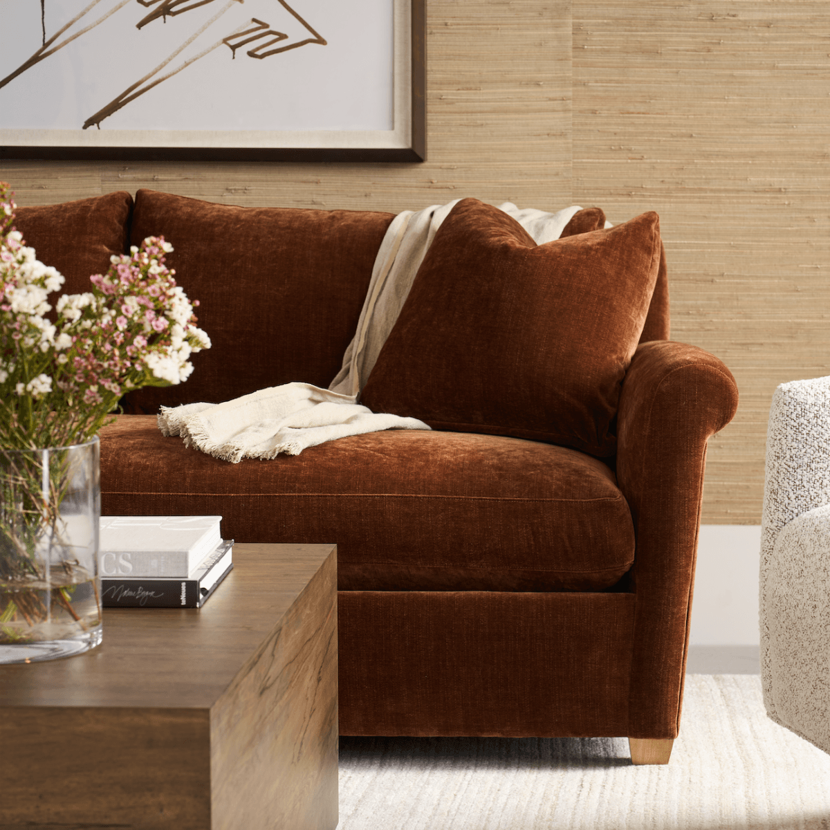
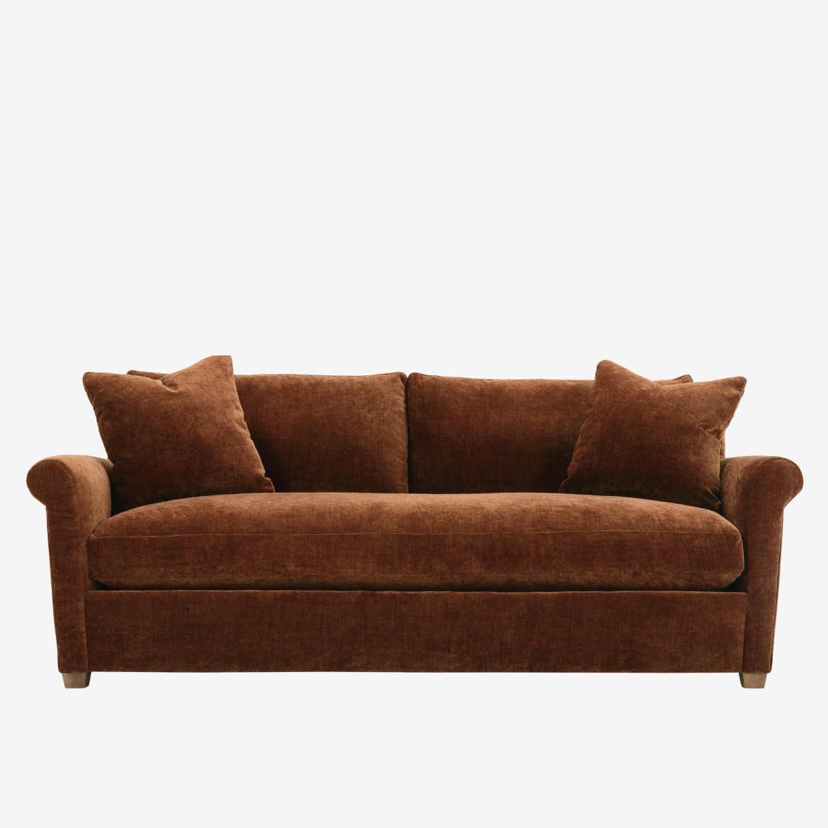
Reinvent your Comfort Zone
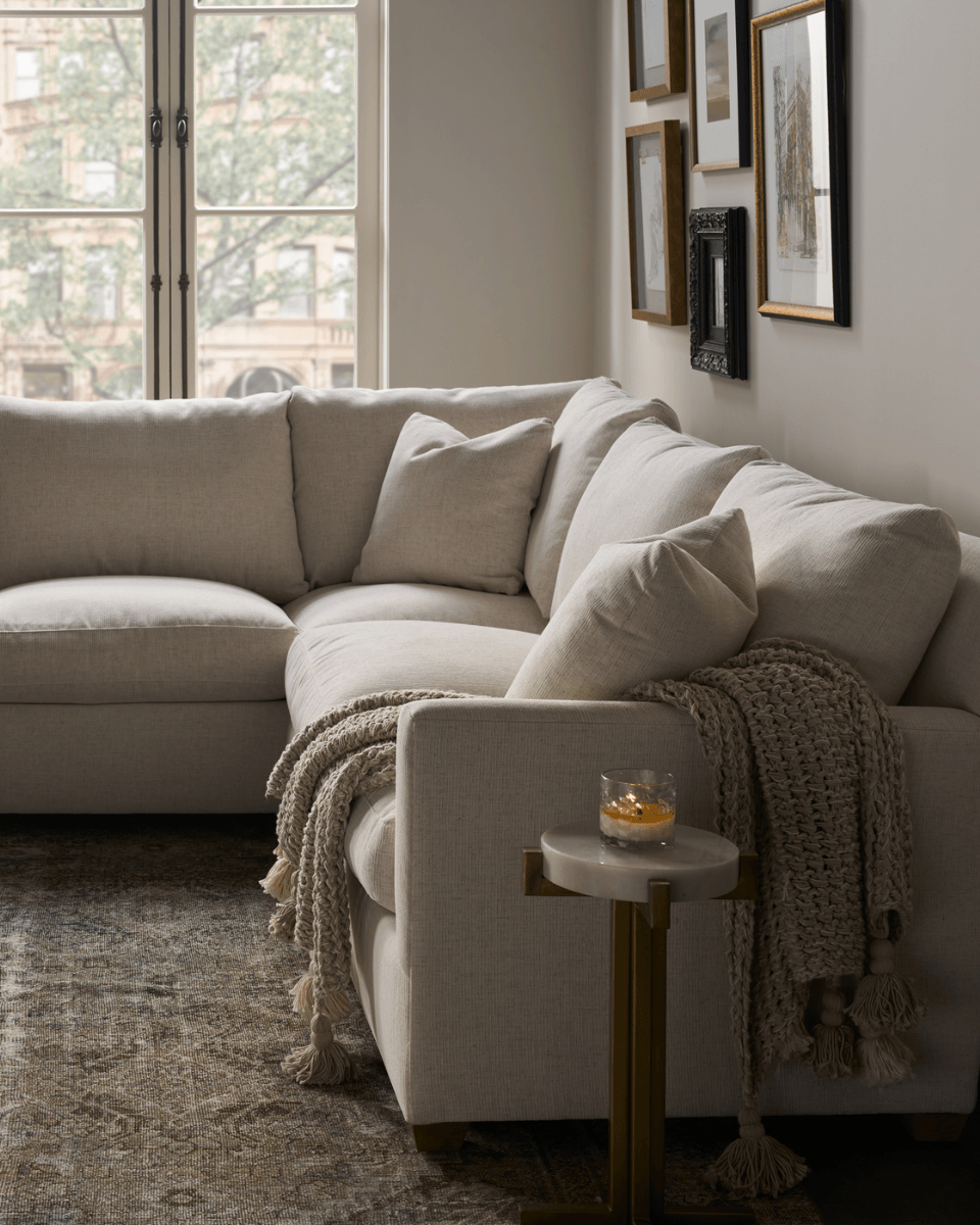
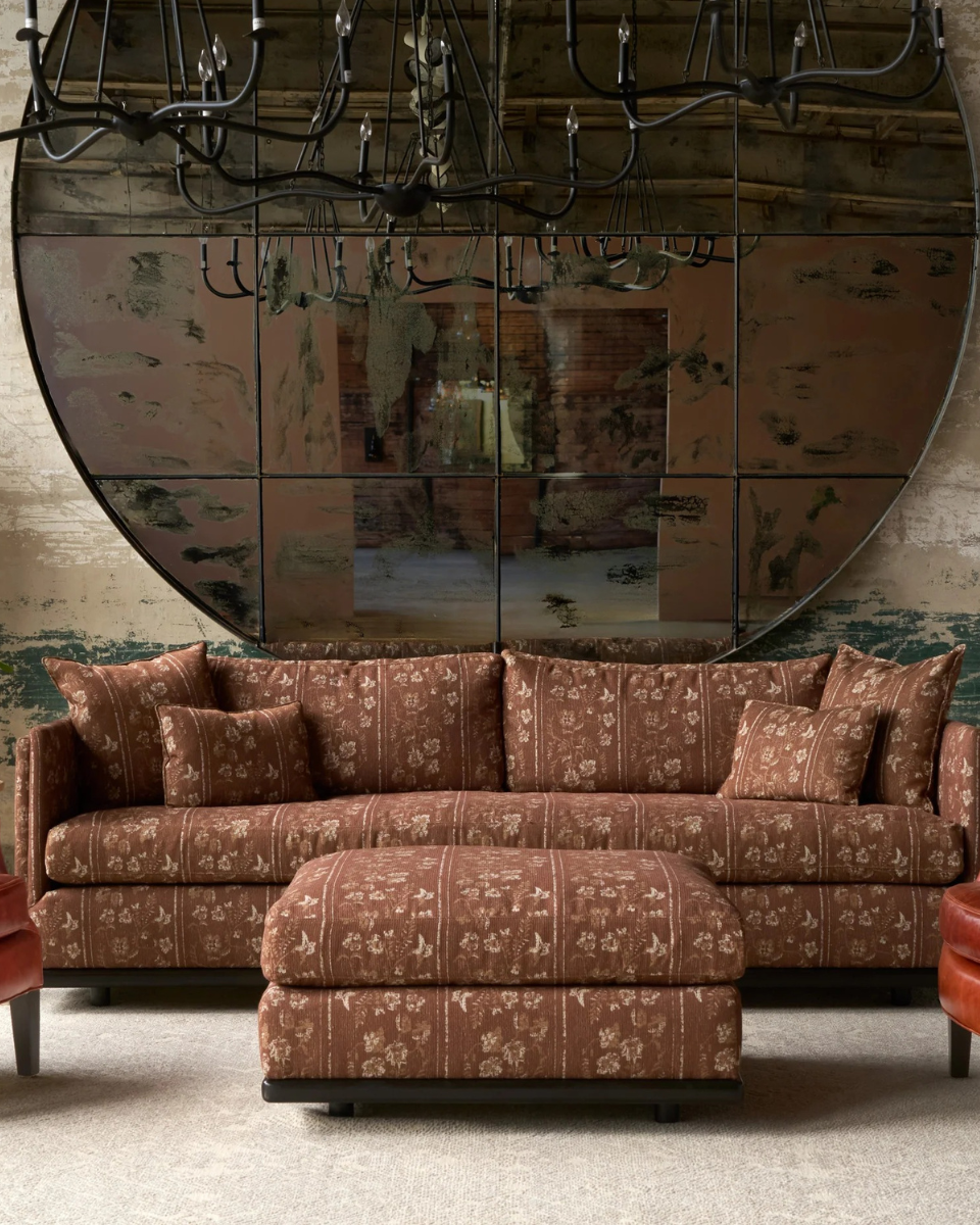
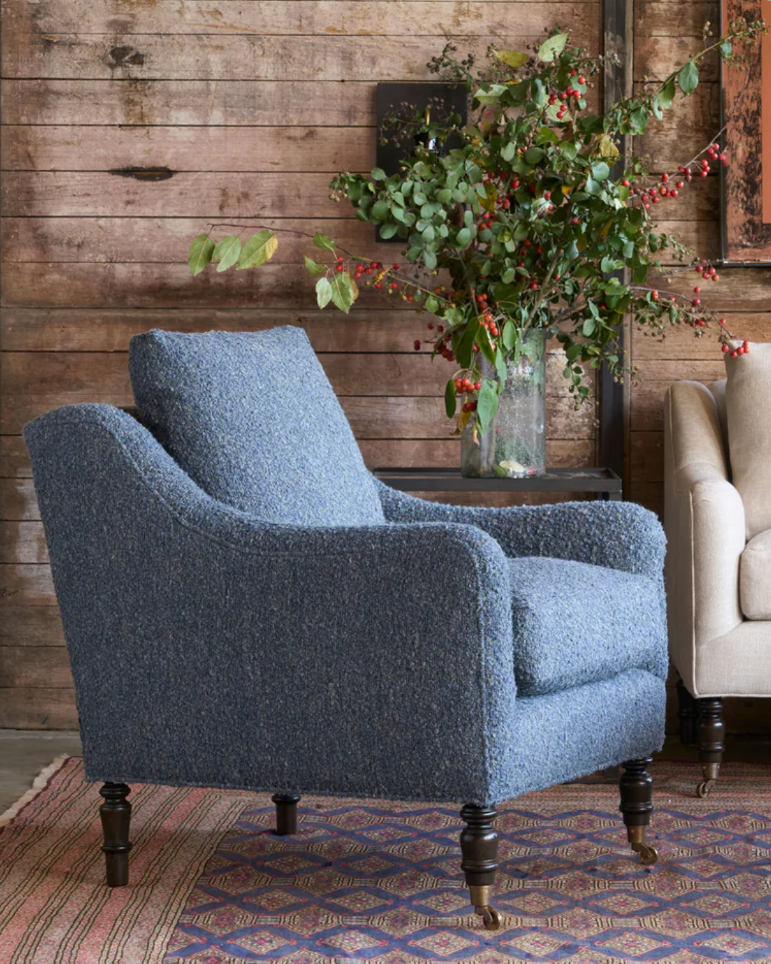
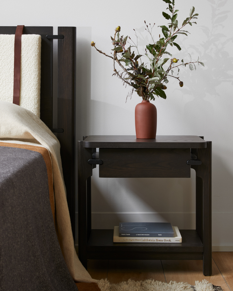
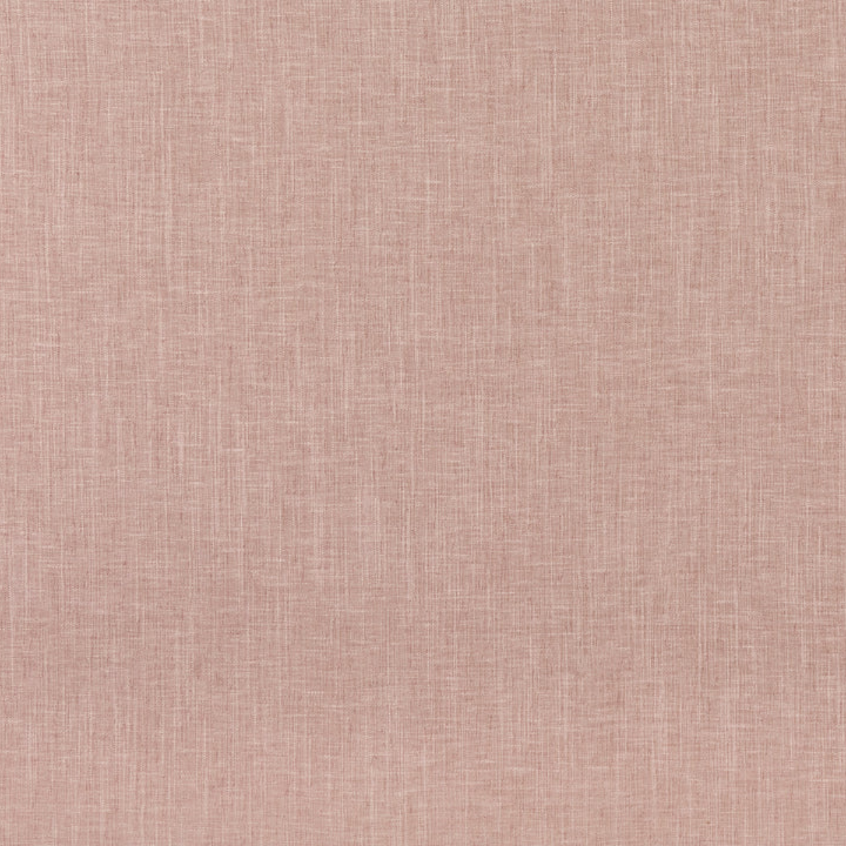
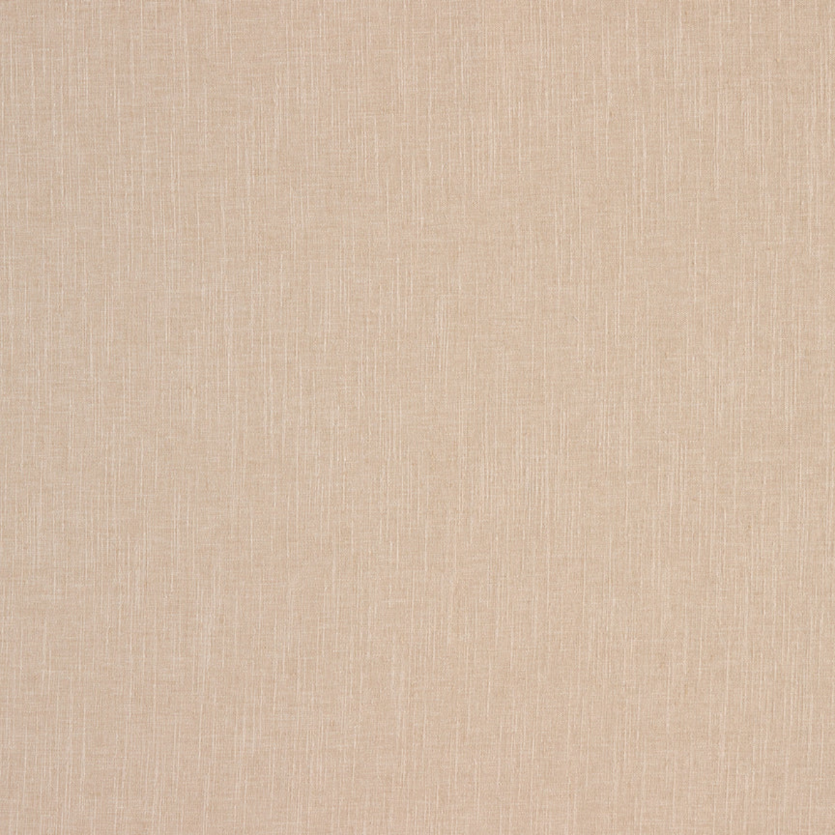
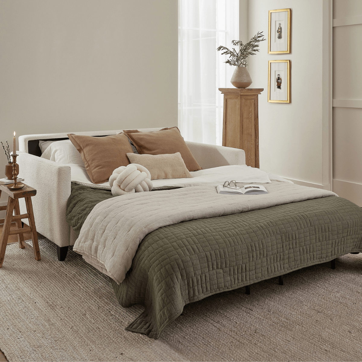
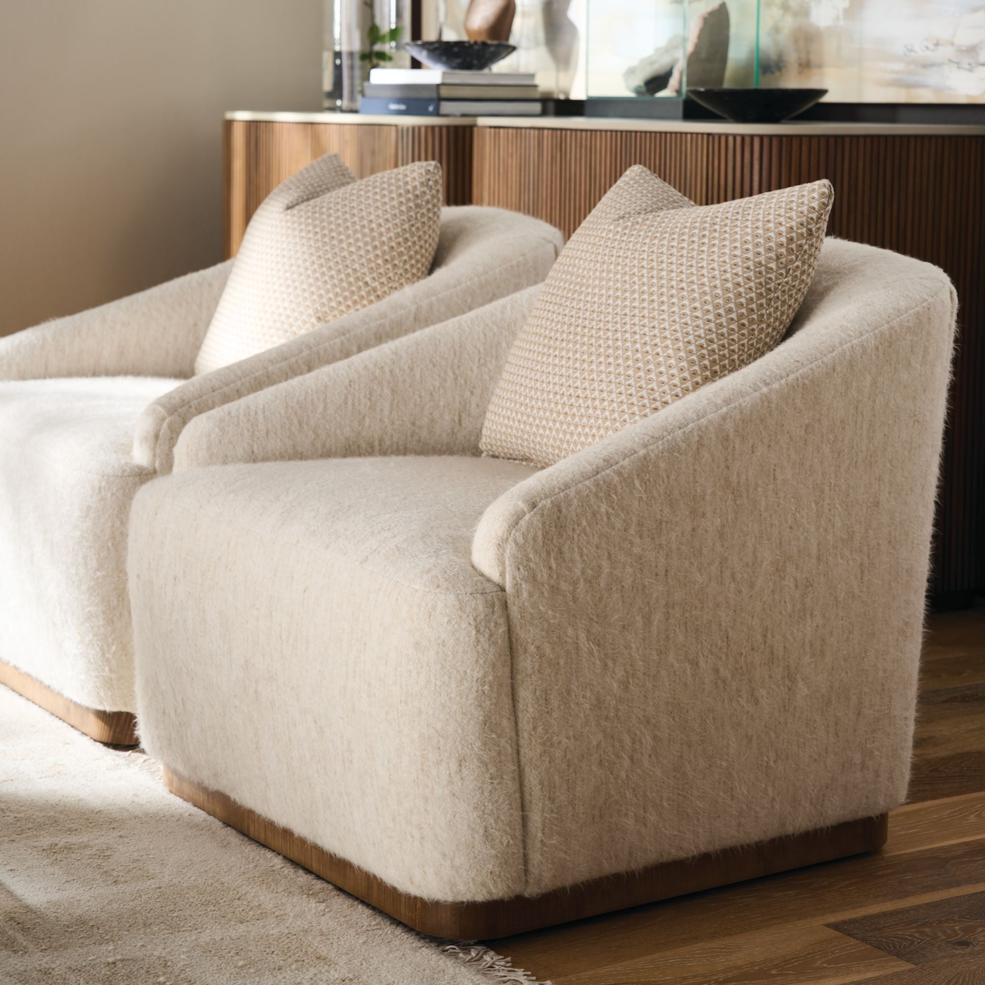
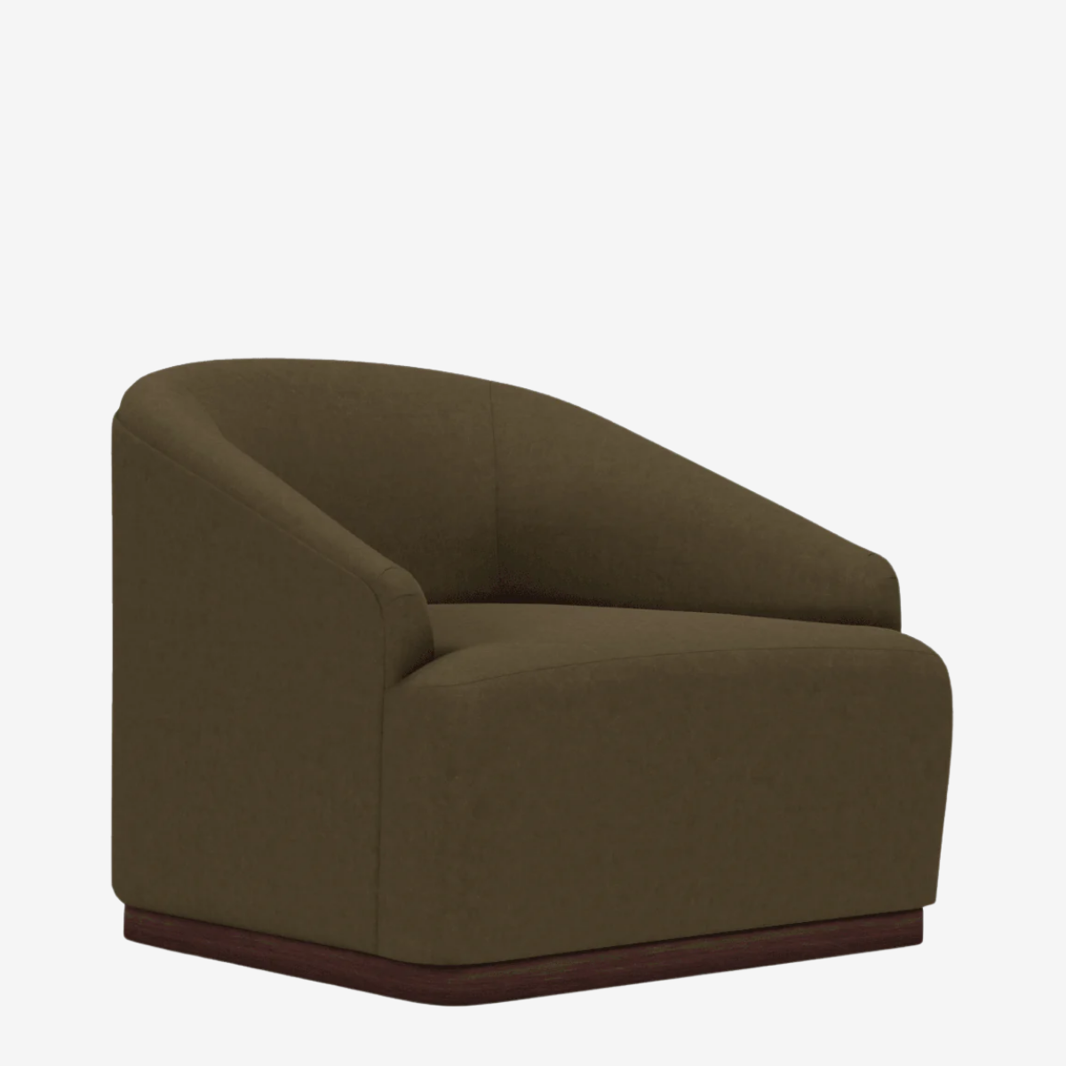
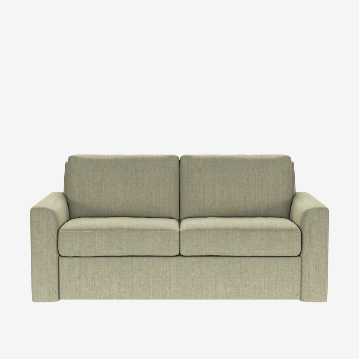
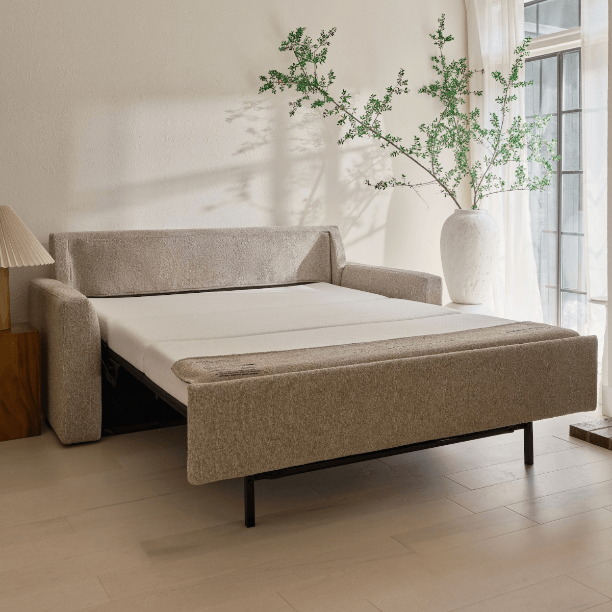
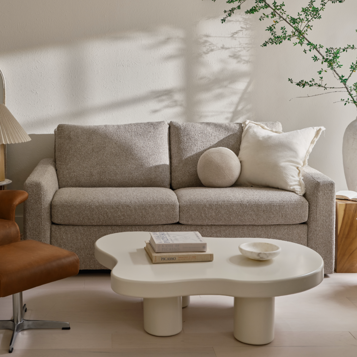
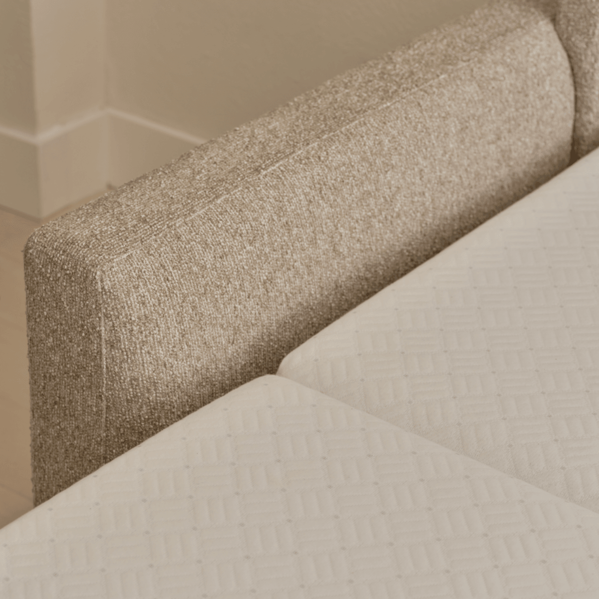
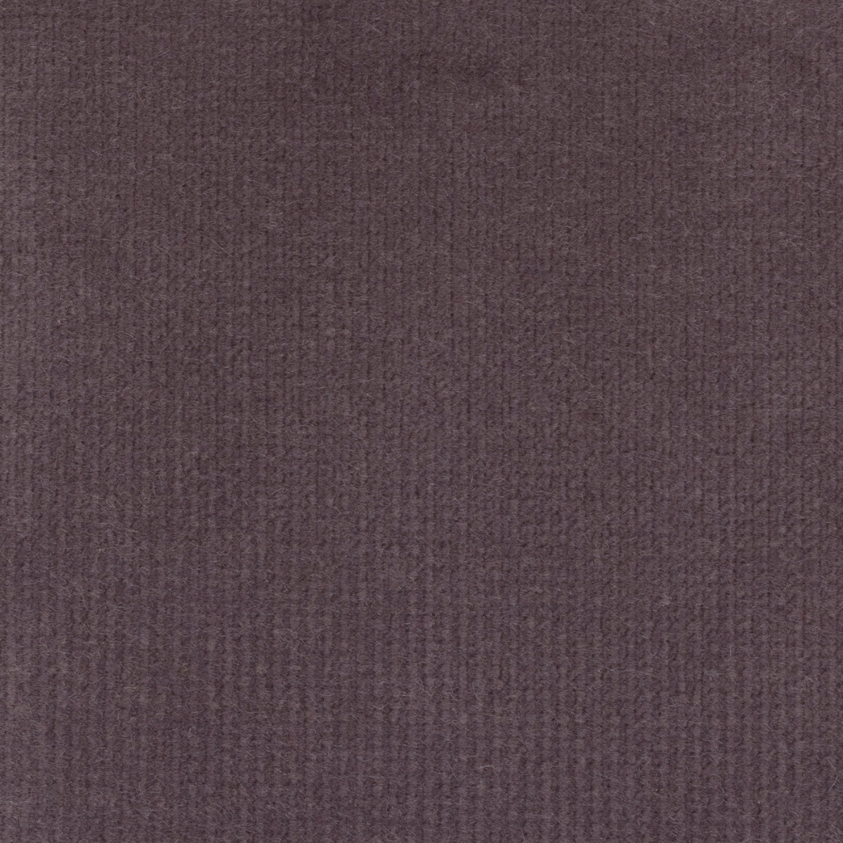
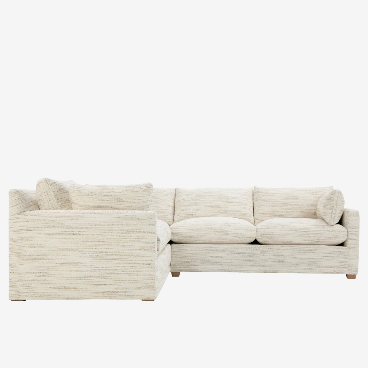
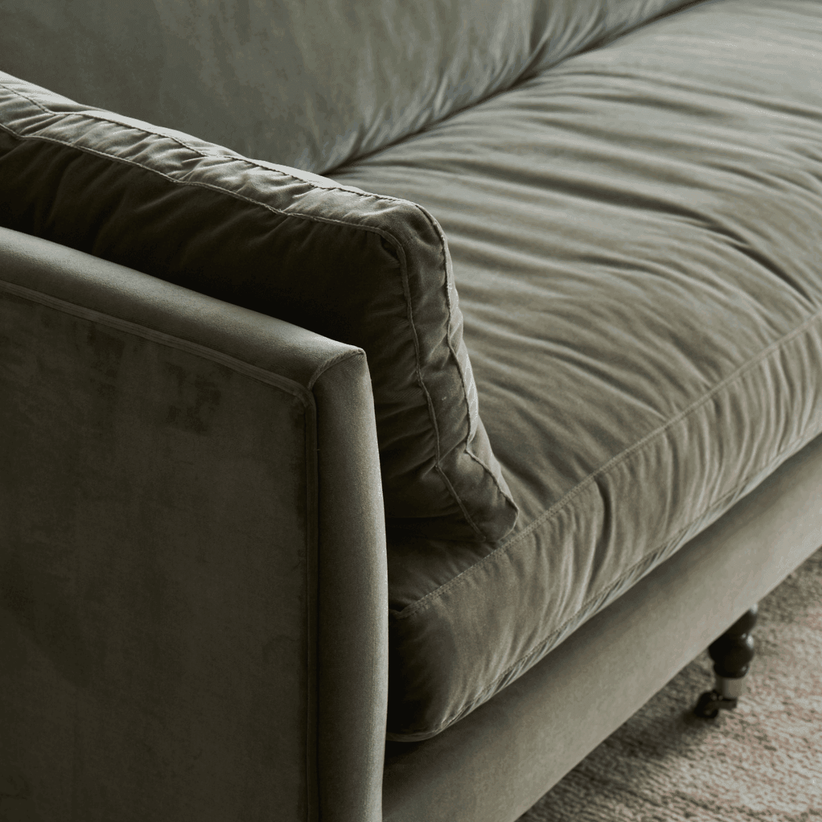
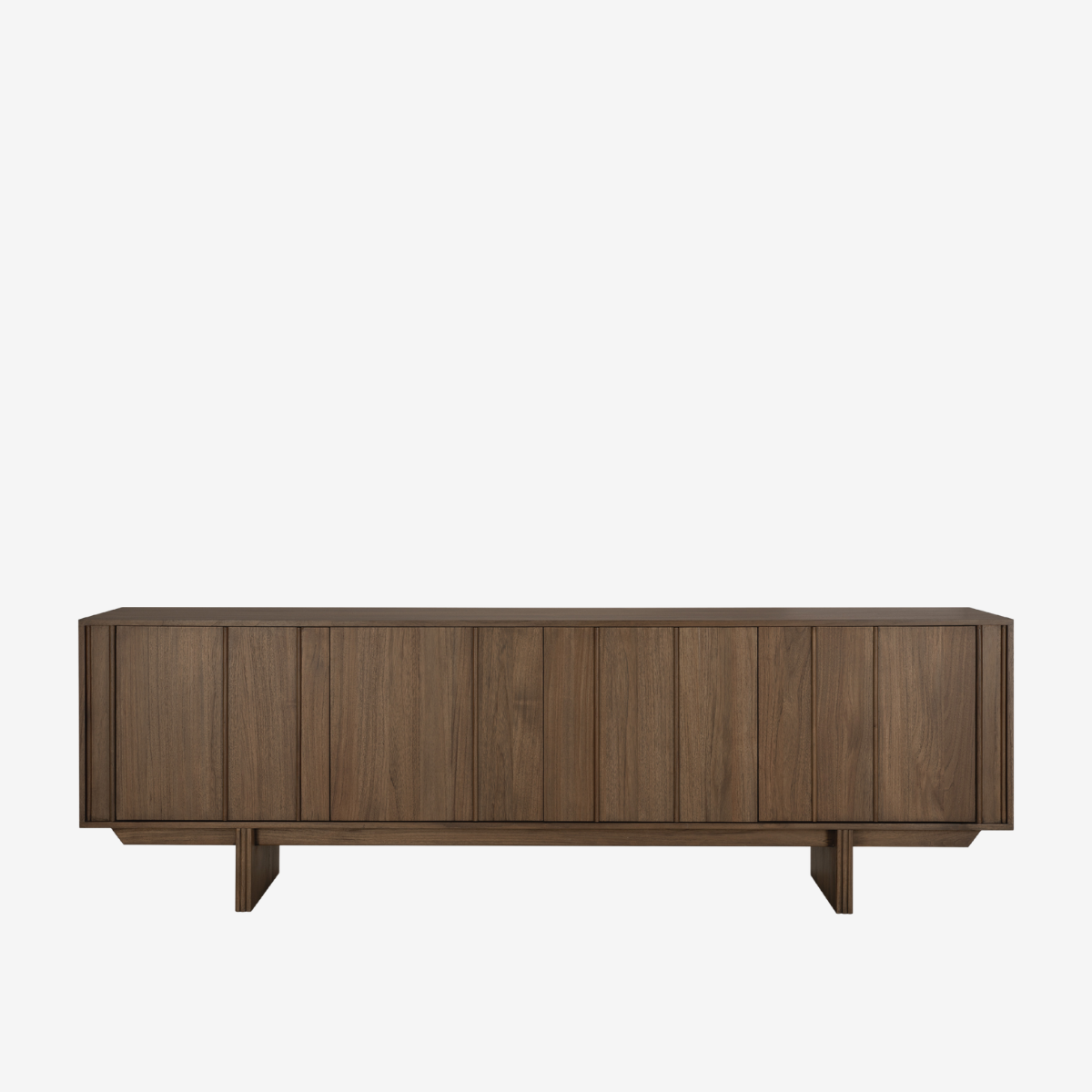
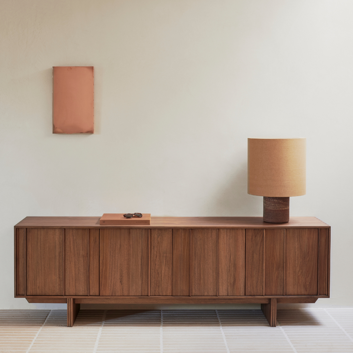
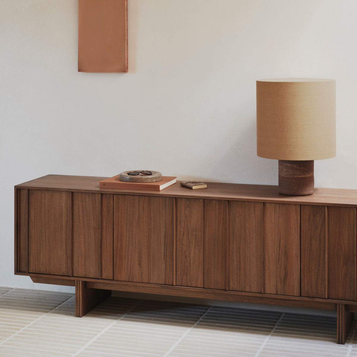
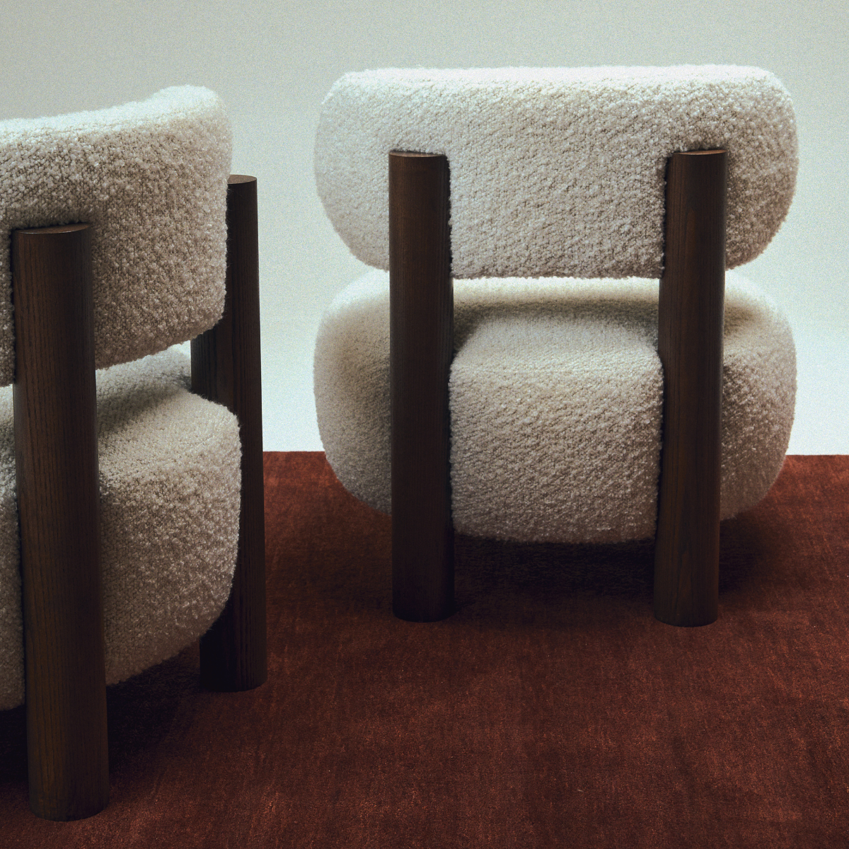
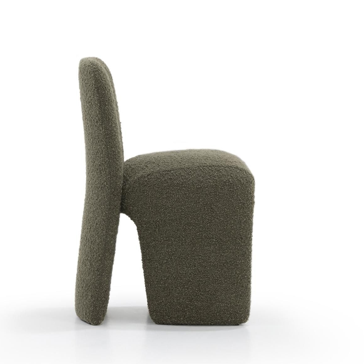
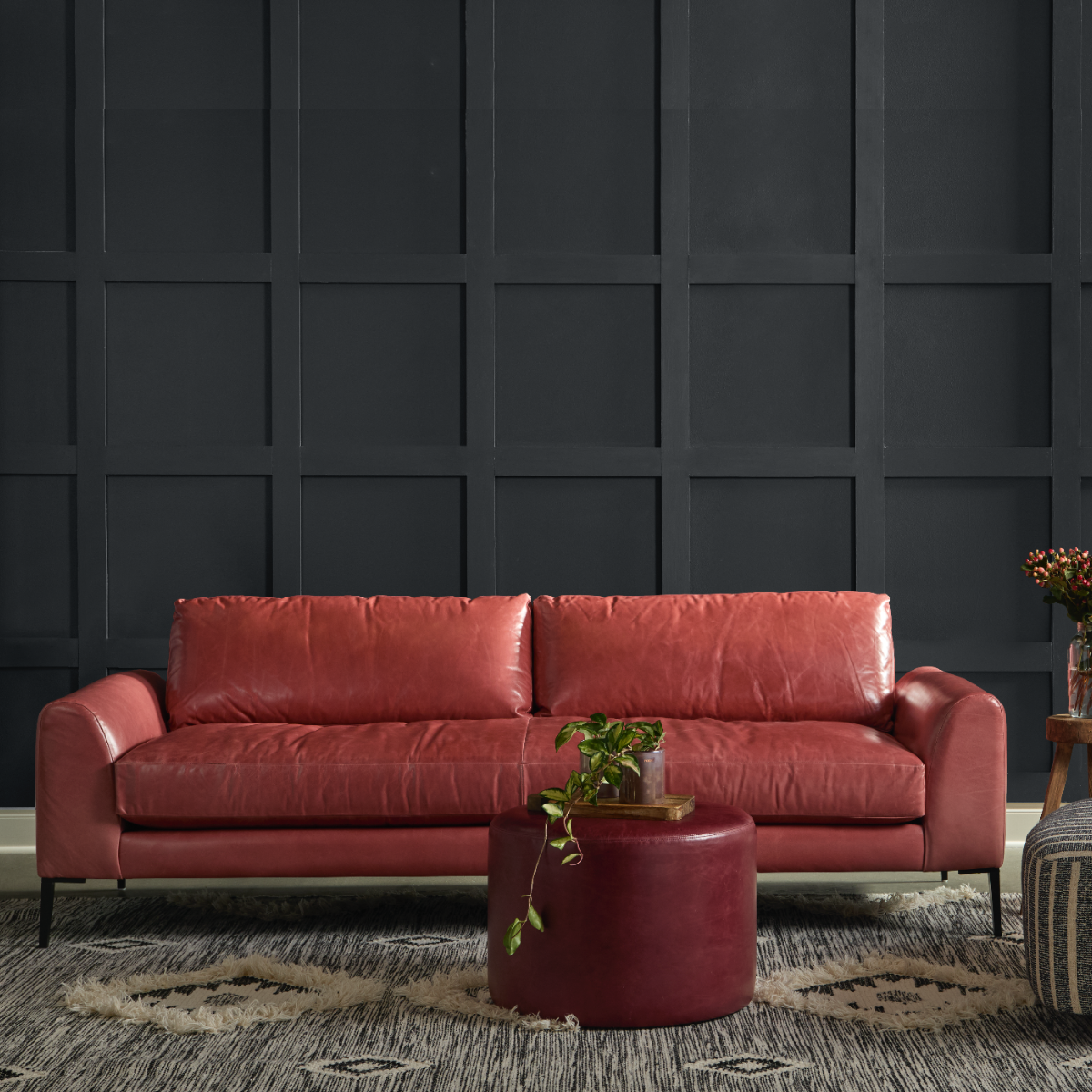
Don’t be fooled by the name; this color palette is so much more than a return to the familiar. Instead, you might think of this year’s “comfort zone” as an act of intentional introspection and reinvention, where tranquil neutrals blend harmoniously with the warm browns and burgundies that continue to gain momentum in 2026. Include Cloud Dancer white in this color palette to experience a new way of decompressing and dismantling the noise of everyday life, as you welcome in a fresh sense of purpose and clarity.


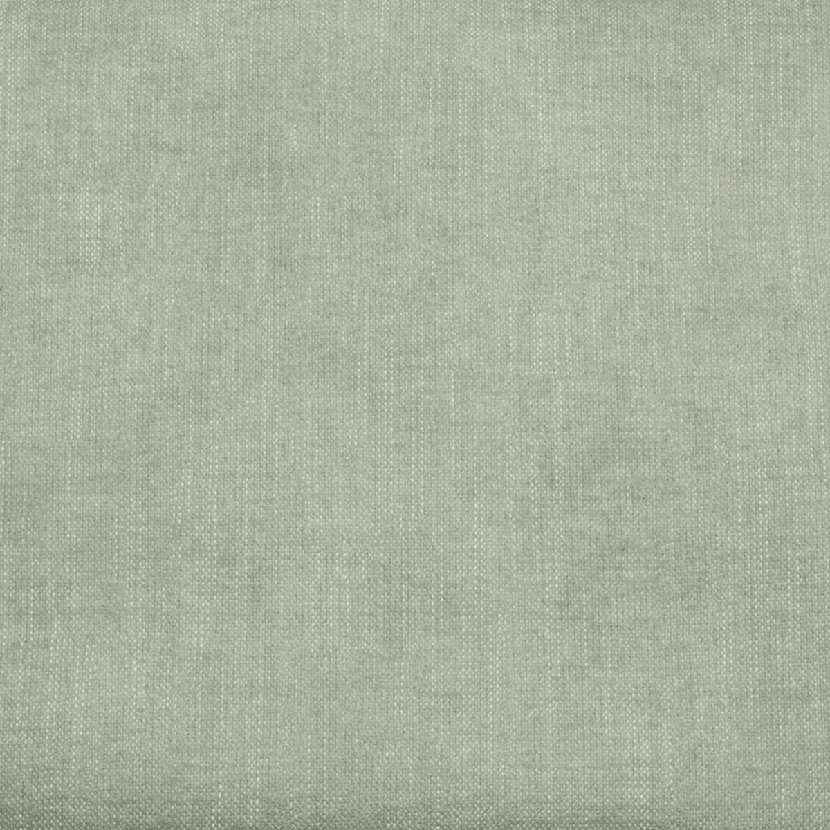
Make an understated statement with Powdered Pastels
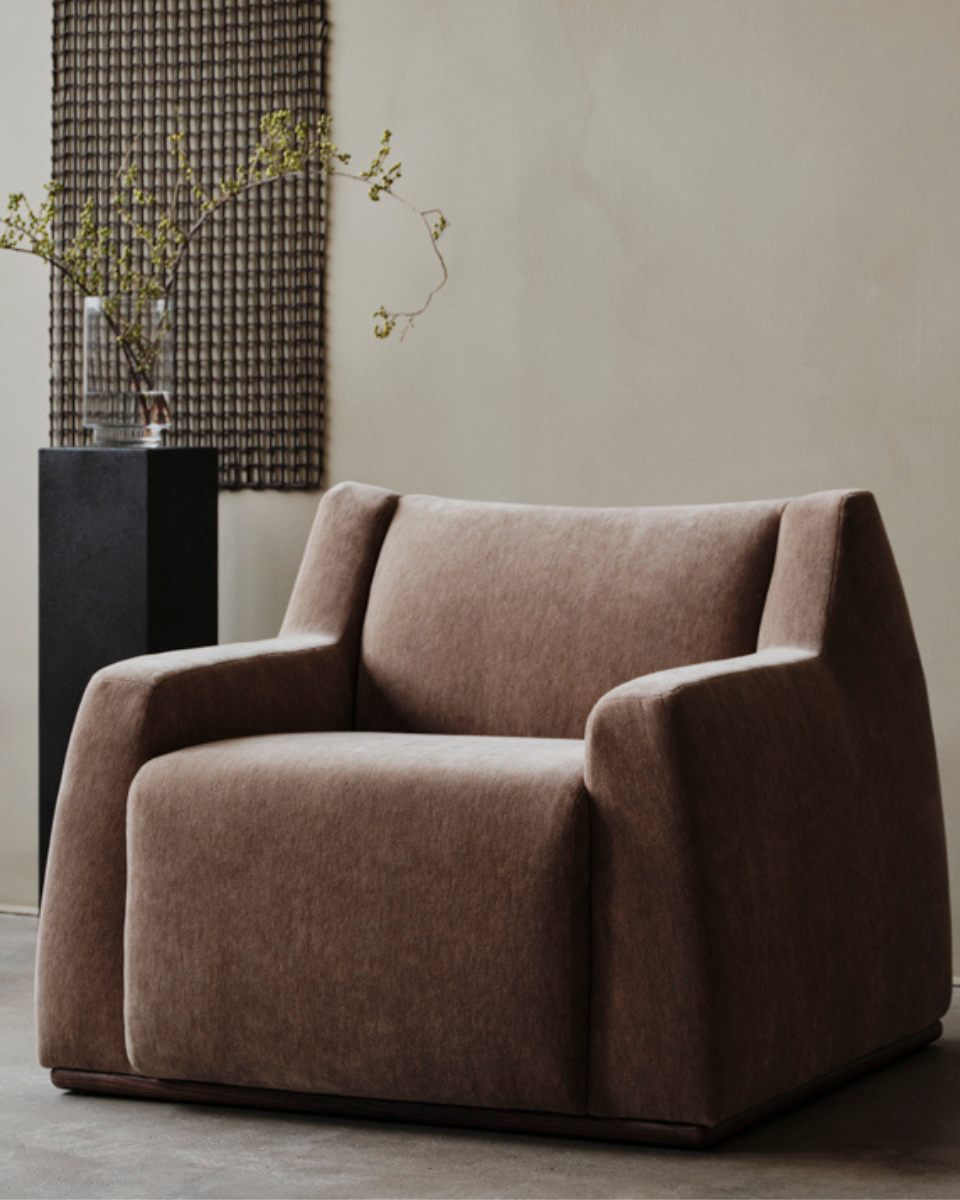
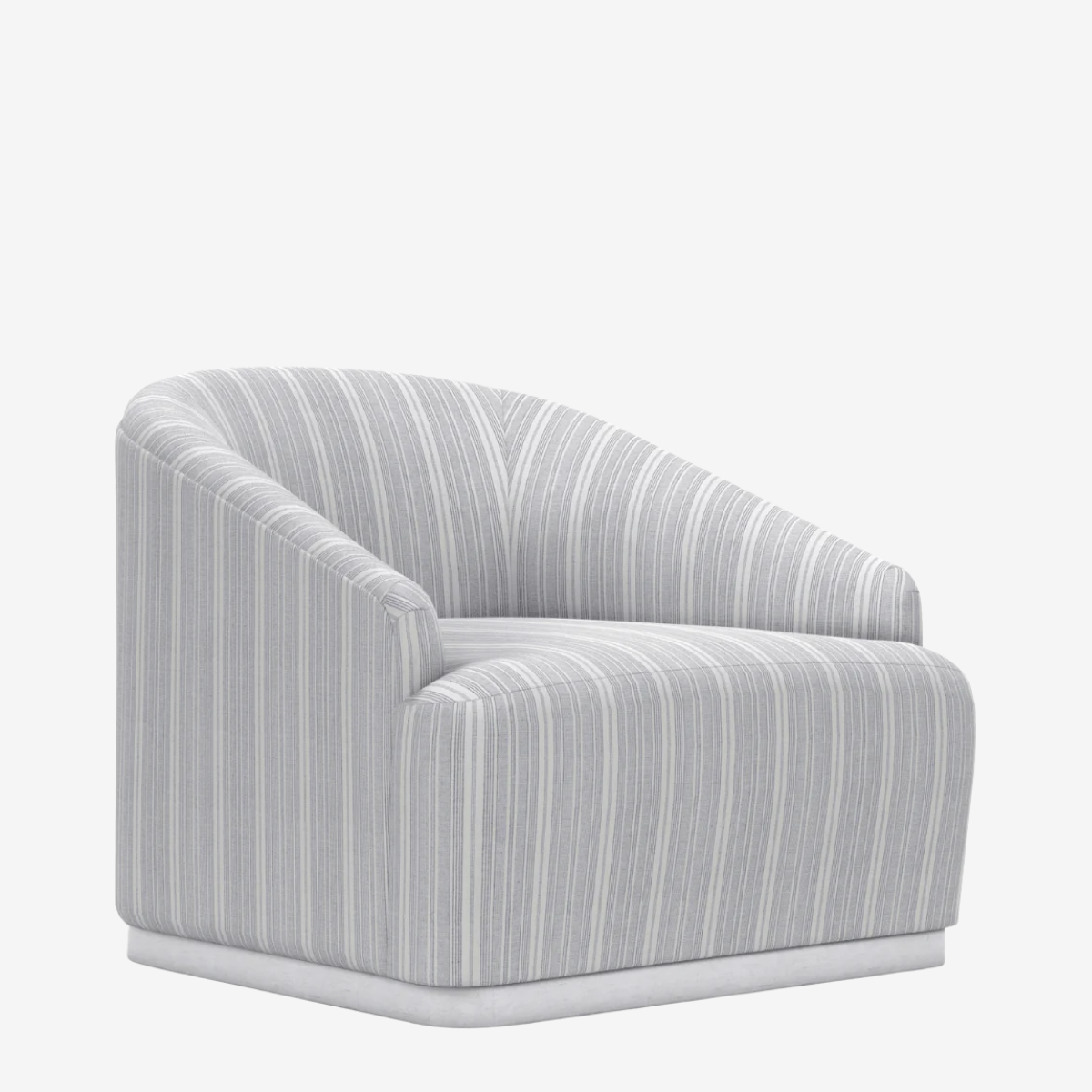
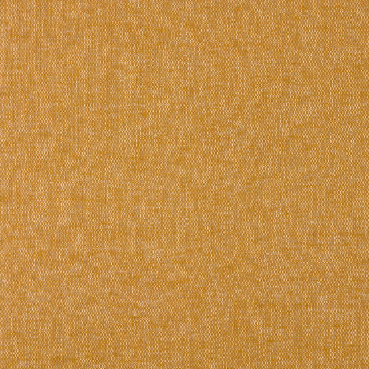
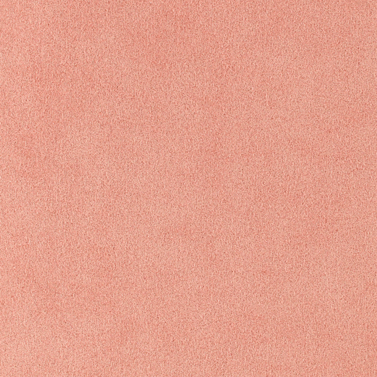
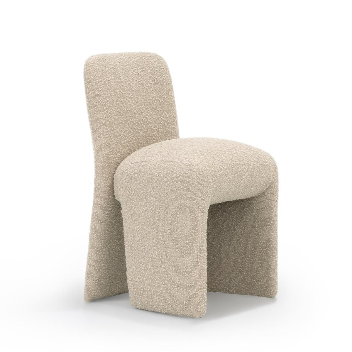
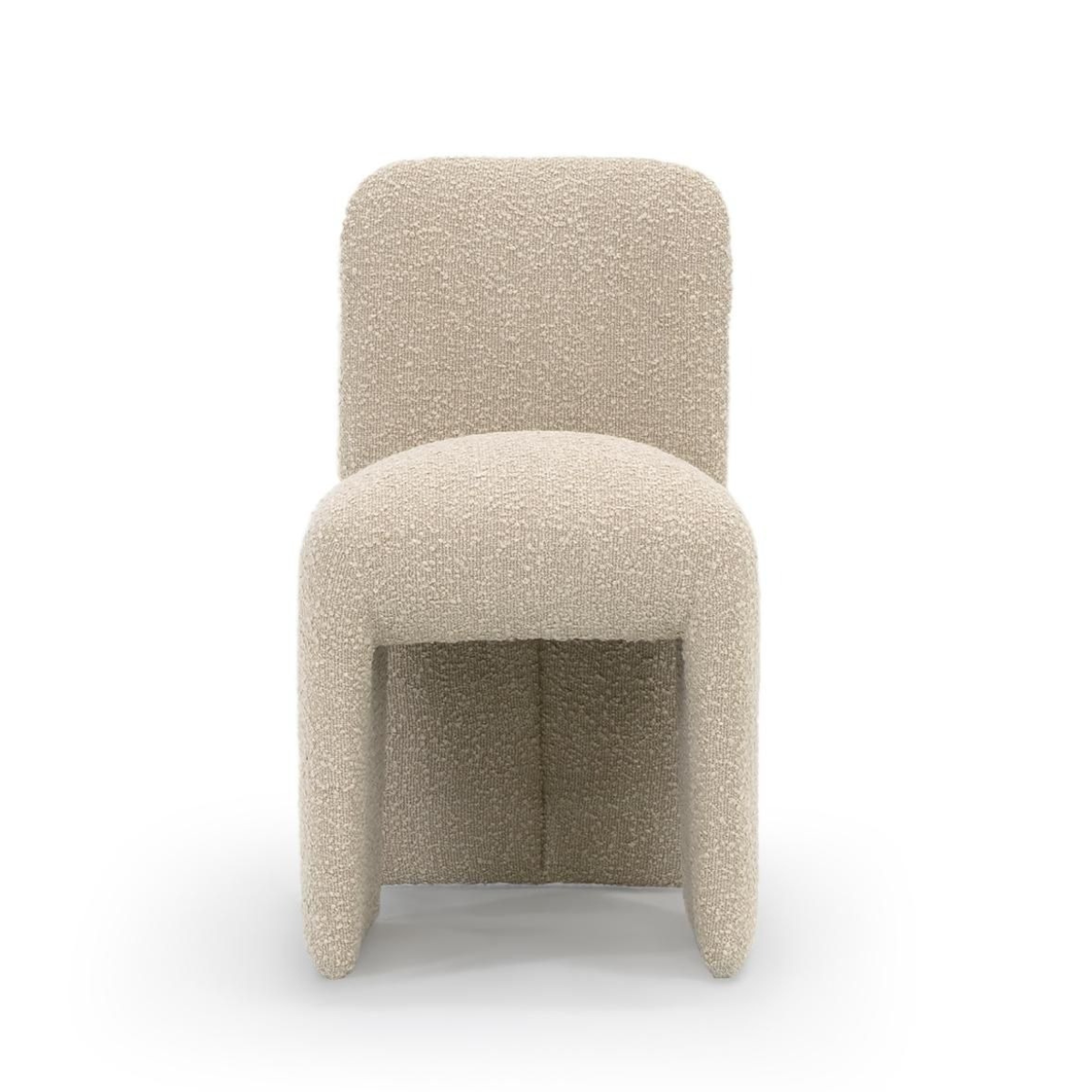
From pastel pink and pistachio green to butter yellow, powdered pastels have been slowly taking the stage as a more subdued color palette with real personality. Soft and gentle as they may be, these subtle and sometimes icy hues still offer a unique sense of character and delight to your space. If you’re looking to refresh a room with a wash of light and pleasing hues, Pantone’s Cloud Dancer pairs with these playful pastel tones effortlessly.


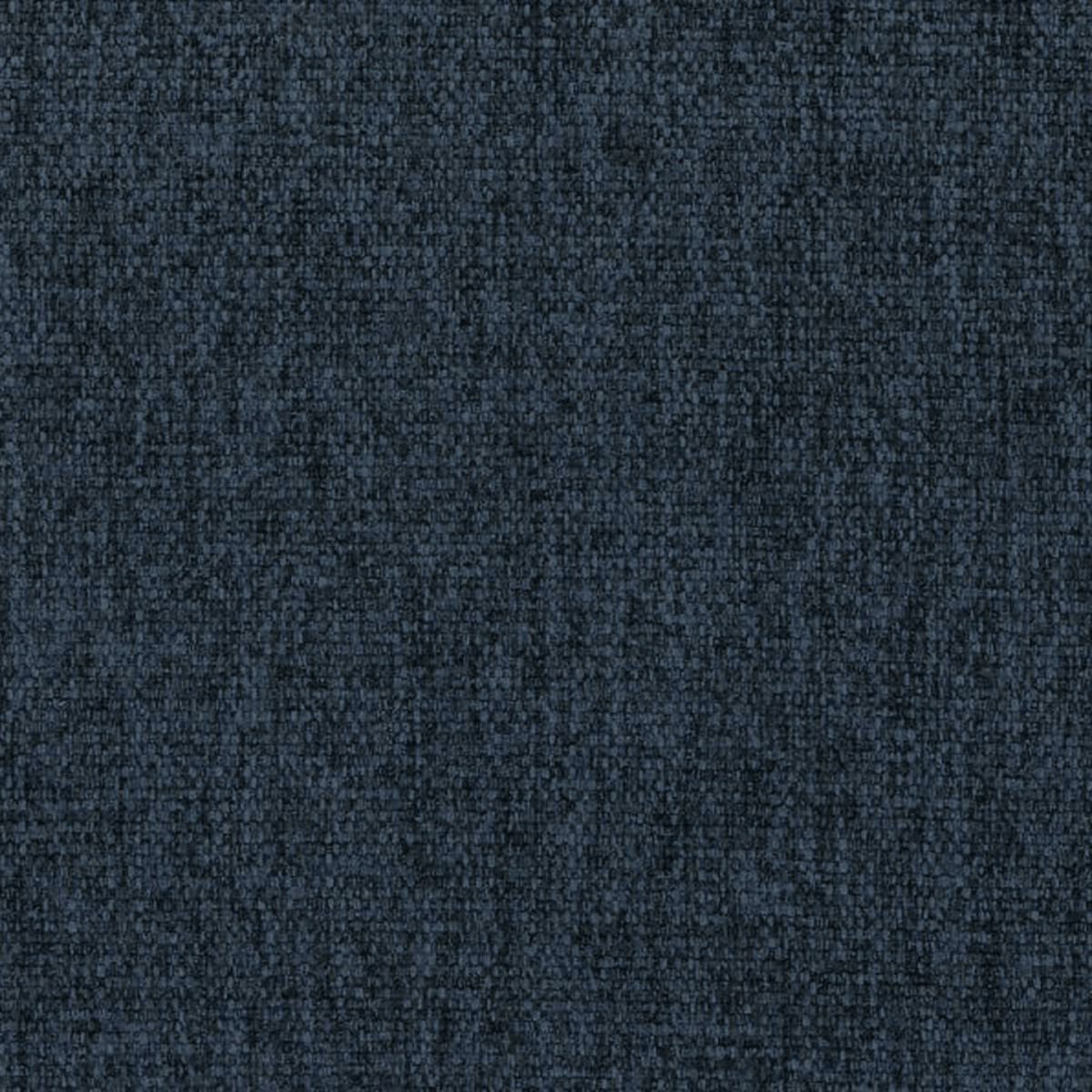
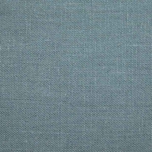
Express your nuance with Light And Shadow
Perhaps you’d like to incorporate Cloud Dancer with a palette that celebrates the spectrum of contrast and ethereal complexity. In that case, Light and Shadow seamlessly dissolves a gradient of soft violets and light lilacs into rich mauves and even darker blues. Bold, yet still tranquil in its gently scaling range, these tones bring a sense of wonder and luxurious intrigue to your interior design.


Take a Break with colors that move you
If you’re looking for the right time to color outside the lines, 2026 is your year, and this is the color palette for you. Giving full permission to explore and pair hues that may not immediately seem like an automatic fit, Take a Break encourages the melding of shades that make you feel good, and light you up. Try adding bold pops of Papaya or Mango Mojito alongside Cloud Dancer, or you might even give Rebel Pink a chance to turn some heads. When you follow your curiosity, you never know what the new year might bring!


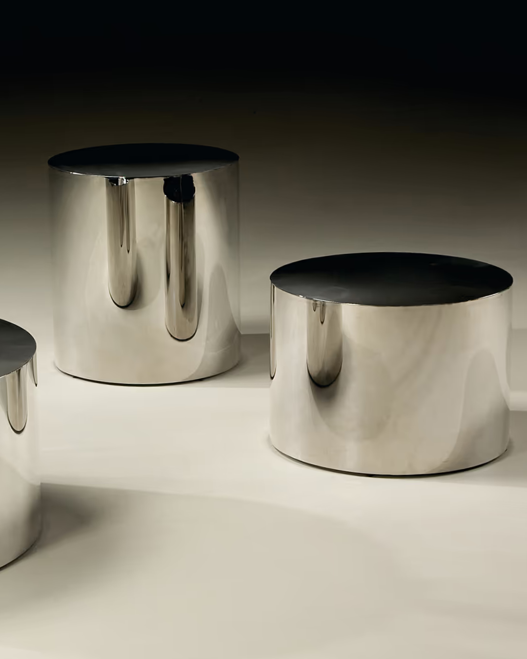
Shine brightly this year with Glamour and Gleam
For a little drama that sparks undeniable sophistication, Glamour and Gleam is a stunning range of shades that really lets Cloud Dancer shine. Imagine the classic white and black of elegant black-tie attire, and the vintage wine, satin silver, and sparkling gray of a truly unforgettable affair. This color palette is also a perfect home for other popular 2026 hues, like the charcoal of Benjamin Moore’s silhouette, and iconic teal, so let it imbue your interior design with a touch of refinement and allure this year.


For more ways to incorporate Pantone’s 2026 Color of the Year, or to get assistance with any questions or layout ideas for your next furniture and home decor investments, don’t forget that our team of expert designers is always ready to help. Just schedule your complimentary consultation today, and we’re happy to offer additional guidance and expertise on any interior design projects you’re hoping to see through this new year!